
Risk heatmaps are powerful visuals that help leaders identify threats and opportunities, but misinterpreting their colors or scale can lead to poor decisions. To use them effectively, pay close attention to the legend, understand what each color signifies, and consider the context behind the map. Be aware of emotional reactions and biases that might skew judgment. By applying these tips and incorporating qualitative insights, you’ll navigate risks more accurately—continue to explore how to optimize your risk assessments.
Key Takeaways
- Always verify legend and color codes to accurately interpret risk severity and avoid misreading risk levels.
- Avoid assuming uniform meanings across different heatmaps; contextualize colors within the specific map.
- Incorporate qualitative insights and data validation to prevent overreliance on visual cues alone.
- Be aware of emotional reactions to certain colors (e.g., red) that may bias risk perception.
- Regularly update and re-examine heatmaps to ensure they reflect current risks and organizational changes.
Why Leaders Use Risk Heatmaps to Make Smarter Decisions

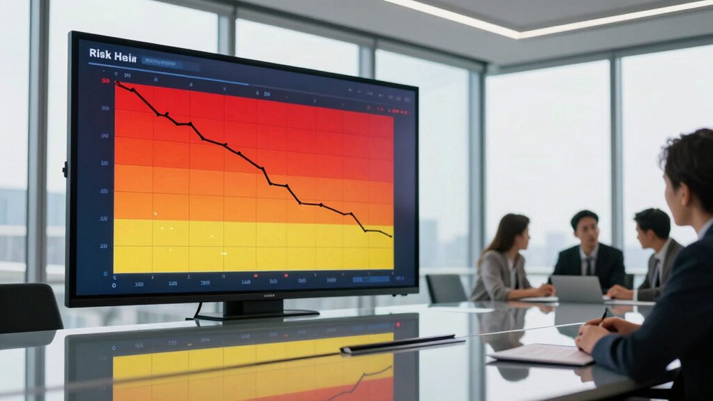
Leaders turn to risk heatmaps because they provide a clear visual overview of potential threats and opportunities. This visual format helps you grasp complex information quickly, reducing the influence of decision bias. When you rely solely on numerical data or reports, your risk perception can become skewed, leading to overly cautious or reckless choices. Heatmaps highlight areas requiring attention, enabling you to see the bigger picture and make more objective decisions. They also help you identify where your judgment may be clouded by biases, such as optimism or familiarity. By offering an immediate, intuitive view, risk heatmaps empower you to prioritize risks effectively, balancing caution and opportunity, and ultimately making smarter, more informed decisions. Incorporating contrast ratio considerations can further improve your understanding of image quality, helping you evaluate visual information with greater accuracy. Additionally, understanding the categorization of risks through heatmaps allows leaders to allocate resources more efficiently and respond proactively to emerging threats. Recognizing visual clarity, which is essential for interpreting heatmaps accurately, ensures that the information presented is both reliable and actionable. Leveraging these visual tools can also enhance your awareness of connected equipment and how it influences overall risk management strategies. A deeper understanding of natural environments in the context of risk assessment can further refine decision-making processes.
How to Read a Risk Heatmap Effectively

To read a risk heatmap effectively, start by evaluating the risk levels indicated on the chart. Pay attention to the color codes, which quickly show you the severity and likelihood of each risk. Use this information to prioritize issues based on their potential impact and urgency. Additionally, understanding cybersecurity threats helps in assessing the risks associated with digital assets and systems. Recognizing risk assessment methodologies can further improve your ability to interpret and act on the data presented. Familiarity with risk visualization techniques also enhances your overall comprehension of the heatmap’s insights. Developing an understanding of support breakfast options can be useful when considering operational risks in hospitality settings, where menu choices and service quality impact overall safety and customer satisfaction. Being aware of risk management strategies can help you implement effective measures to mitigate identified risks.
Assess Risk Levels
Understanding how to read a risk heatmap effectively is essential for accurately evaluating risk levels. Your goal is to judge whether a risk falls into low, medium, or high categories, considering both likelihood and impact. Be aware that risk perception can be influenced by decision bias, leading you to underestimate or overestimate certain risks. Use the following table to help interpret the heatmap:
| Risk Level | Description |
|---|---|
| Low | Manage with routine controls |
| Medium | Requires monitoring and action |
| High | Immediate attention needed |
| Critical | Urgent, potential crisis |
Focus on the position of each risk on the map, understand its context, and avoid subjective biases that skew risk assessment. Additionally, be mindful of how decision bias can distort your perception of risk severity, leading to inaccurate evaluations. Recognizing that electric dirt bikes can produce between 10 to 20 horsepower and offer instant torque, for example, helps to contextualize their risks and benefits accurately. This approach ensures a clearer, more objective view of potential threats. Moreover, understanding the visual representation of risks enhances your ability to interpret heatmaps effectively, leading to better decision-making. Being aware of potential emotional reactions that might influence your interpretation can also improve the accuracy of your assessments. Incorporating educational resources on risk analysis can further strengthen your ability to make informed decisions.
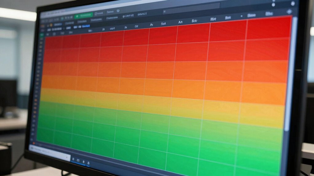
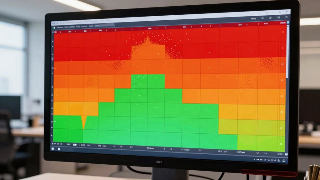
Interpret Color Codes
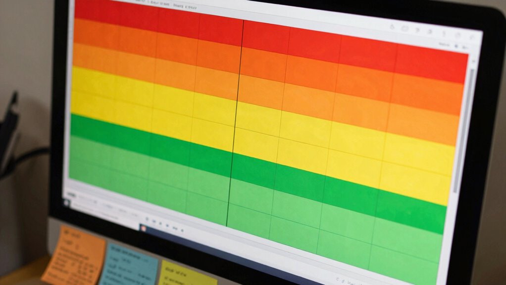
Interpreting the color codes on a risk heatmap is vital for quickly evaluating the severity of each risk. Color symbolism helps you instantly grasp which risks demand urgent attention, as warm colors like red often indicate high danger, while cooler tones like green suggest lower risk levels. Your visual perception plays an essential role here; sharp contrasts and consistent color schemes make it easier to differentiate between risk categories at a glance. Pay close attention to the legend or key, as it clarifies what each color signifies in your specific context. Proper interpretation guarantees you don’t overlook critical issues or misjudge the urgency of particular risks. Mastering this skill allows you to make faster, more informed decisions based on the visual cues provided by the heatmap. Recognizing Color symbolism enhances your ability to interpret risk levels effectively. Additionally, understanding risk categorization is crucial for prioritizing issues accurately and efficiently. Familiarity with visual perception principles further improves your ability to distinguish subtle differences in risk levels quickly. Developing an understanding of risk severity helps you allocate resources more effectively and address the most pressing concerns first. Moreover, being aware of how contextual factors influence risk interpretation ensures a more nuanced and accurate assessment.
Prioritize Based On
Once you’ve grasped how color codes represent risk levels, the next step is to prioritize actions based on what you see. Focus on risks in the high-risk zones—these demand immediate attention, especially if they threaten key objectives or stakeholder engagement. Consider your organization’s risk aversion; if you’re more risk-averse, you might act sooner on moderate risks to prevent escalation. Conversely, a lower risk appetite may delay responses until risks reach critical levels. Use the heatmap to identify where resources should be allocated first, ensuring you’re addressing the most impactful threats. Remember, effective prioritization aligns with stakeholder interests and confidence, helping you manage risks strategically rather than reactively. This approach guarantees that your risk mitigation efforts are both timely and relevant. Incorporating risk management principles can further enhance your decision-making process.
Common Mistakes When Interpreting Risk Heatmaps
One common mistake when working with risk heatmaps is misreading the color codes or scales, which can lead to risk misinterpretation and color confusion. This often results in underestimating or overestimating threats, impairing decision-making. To avoid this, be mindful of:
- Assuming uniform color meanings across different heatmaps
- Ignoring legends or keys that clarify color significance
- Overlooking subtle color differences that indicate varying risk levels
- Misinterpreting color intensity as risk magnitude without context
- Relying solely on visual cues without cross-referencing data
- Understanding market nuances helps ensure accurate risk assessments when analyzing heatmaps.
- Additionally, familiarity with visual perception principles can improve your ability to accurately interpret complex color schemes.
Recognizing these pitfalls helps guarantee you accurately interpret risk levels and avoid dangerous assumptions. Proper understanding of color coding is essential for effective risk management, preventing costly mistakes driven by confusion.
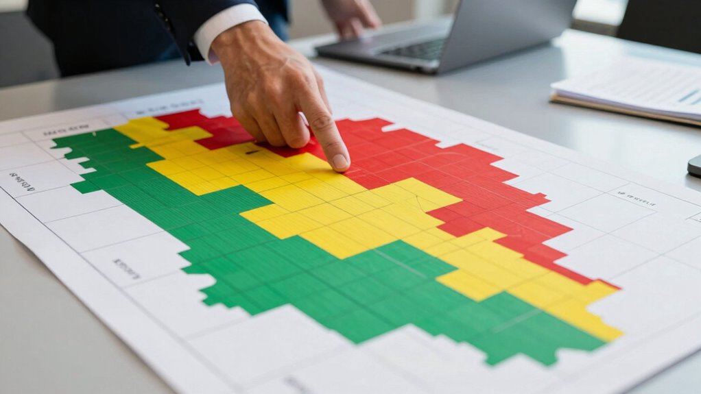
What Do the Colors Really Mean? Decoding Risk Heatmap Colors
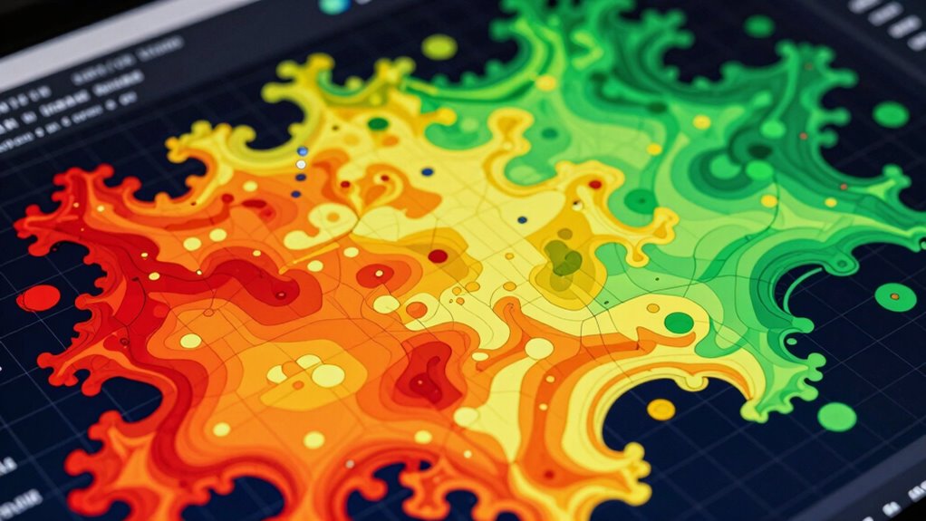
Understanding what the colors on a risk heatmap truly represent is essential for accurate risk assessment. Color symbolism plays a key role in conveying risk levels quickly, but it can also evoke strong emotional responses. For example, red often signals danger or high threat, prompting urgency, while green suggests safety or low risk, creating a calming effect. Recognizing these emotional impacts helps you interpret the map more objectively, avoiding overreactions or complacency. Keep in mind that color schemes can vary between organizations, so always check the legend. By decoding what each color truly means, you ensure you’re making well-informed decisions based on accurate visual cues rather than assumptions or emotional biases. This awareness helps you use heatmaps as effective tools, not misleading signals.
Is Your Risk Prioritization Accurate? How to Check
To guarantee your risk prioritization is accurate, you need to verify that your heatmap data aligns with real-world conditions and your organization’s objectives. Check for risk misclassification by cross-referencing heatmap categories with actual incident data and outcomes. Be aware of bias detection issues that can skew risk perception, such as overemphasizing certain risks while neglecting others. Incorporate fin and forage principles to ensure your risk assessments support sustainable and resilient decision-making. Consider these steps:
Ensure your risk heatmap accurately reflects real-world data and organizational priorities to prevent misclassification and bias.
- Validate data sources for completeness and reliability
- Reassess risk thresholds regularly
- Engage diverse teams to identify potential biases
- Compare heatmap priorities with historical incident patterns
- Conduct sensitivity analyses to test robustness
These measures help ensure your risk prioritization reflects reality, avoiding errors that could lead to misinformed decisions.
Why Context Matters When Reading Risk Heatmaps

Your interpretation of a risk heatmap depends heavily on the specific context you’re analyzing. Different industries face unique threats and priorities, which can modify how risks are perceived. Recognizing these differences ensures you make more accurate and relevant decisions based on the heatmap.
Context Shapes Interpretation
Because risk heatmaps can be interpreted in many ways, the context in which they’re used dramatically influences their meaning. Your risk perception and decision bias shape how you read these visuals. A heatmap in finance might highlight market volatility, while in healthcare, it emphasizes patient safety. Understanding the environment, goals, and stakeholder perspectives is essential. Consider these factors:
- Organizational priorities and risk appetite
- Cultural attitudes toward risk
- Historical data and recent events
- Regulatory or industry standards
- Specific decision-making scenarios
Variability Across Industries
Risk heatmaps vary markedly across industries, as each sector faces unique threats and priorities. This sectoral variability means that a high-risk area for one industry might be negligible for another. For example, financial firms prioritize cyber risks, while manufacturing focuses on supply chain disruptions. Understanding industry-specific risks helps you interpret heatmaps accurately.
| Industry | Common Risks | Key Focus |
|---|---|---|
| Finance | Cyberattacks, fraud | Data security |
| Manufacturing | Supply chain, safety hazards | Operational stability |
| Healthcare | Data breaches, regulatory risks | Patient safety |
Using Qualitative Insights to Improve Your Heatmap Analysis
Integrating qualitative insights into heatmap analysis can substantially enhance the accuracy and depth of your risk assessments. These insights provide context that quantitative data alone can’t capture, improving your risk interpretation. To leverage qualitative insights effectively:
Enhance risk assessments by integrating qualitative insights for richer, more accurate heatmap analysis.
- Gather expert opinions to identify hidden vulnerabilities
- Conduct interviews with frontline staff for real-world perspectives
- Analyze customer feedback to reveal emerging risks
- Review incident reports for patterns not visible in numerical data
- Consider organizational culture and process nuances that influence risk perception
What to Do When Your Heatmap Is Misleading
When your heatmap turns out to be misleading, it’s essential to step back and assess the underlying causes. Sometimes, inaccurate risk perception skews how you interpret data, making certain hazards seem more or less threatening than they truly are. Decision biases, like anchoring or confirmation bias, can also distort your view, leading you to overemphasize familiar risks or dismiss important signals. To correct this, re-examine your data sources and verify your risk assessments are grounded in objective evidence. Challenge your assumptions and seek diverse perspectives to counteract biases. Recognize that heatmaps are tools, not crystal balls. Adjust your approach by questioning initial impressions and recalibrating your understanding of risks, so your decisions become more balanced and informed.
Tips for Using Risk Heatmaps More Effectively in Practice

To make your risk heatmaps more effective, start by clearly defining your risk criteria so everyone understands what each color or level signifies. It’s also essential to update your maps regularly to reflect changing conditions and new information. By doing so, you’ll guarantee your heatmaps remain accurate and useful for decision-making.
Clarify Risk Criteria
Clarifying risk criteria is essential for making your risk heatmaps more effective. Without clear risk criteria, your risk measurement becomes inconsistent, leading to misinterpretations. Define specific thresholds for low, medium, and high risk to ensure everyone understands what each level signifies. This alignment helps in prioritizing actions and resources effectively. Consider these practices:
- Establish objective risk thresholds based on data
- Communicate criteria clearly across teams
- Use consistent language for risk levels
- Incorporate quantitative measures where possible
- Regularly review and refine your risk criteria
Regularly Update Maps
Regularly updating your risk heatmaps guarantees they remain accurate and relevant as conditions change. A dynamic risk assessment relies on current data visualization to identify emerging threats or shifting priorities. Schedule consistent reviews—monthly or quarterly—to reflect new information, incidents, or changes in the environment. This practice helps teams respond proactively rather than reactively. When you update the maps, verify you incorporate recent data sources and reassess risk levels accordingly. Neglecting updates can lead to outdated visuals that misrepresent actual threats, risking misinformed decisions. By maintaining up-to-date risk heatmaps, you improve the clarity of your risk assessment process, empower better strategic planning, and foster a culture of continuous improvement in managing potential hazards.
Building a Critical Thinking Culture Around Visual Risk Tools

Building a culture of critical thinking around visual risk tools requires more than just presenting data; it demands fostering a mindset that questions assumptions and interprets visuals carefully. By understanding how risk perception can be skewed and decision biases influence interpretations, you can prevent misjudgments. Encourage team members to analyze heatmaps beyond surface-level impressions, considering context and potential distortions. Promote questioning of initial impressions and challenge automatic conclusions. Recognize cognitive biases like anchoring or availability bias that may color risk assessments. Cultivate open discussions about uncertainties and alternative perspectives. This approach helps ensure that visual tools serve as aid, not mislead, enhancing decision-making accuracy and resilience in risk management.
Foster critical thinking by questioning assumptions and analyzing visuals carefully to improve risk assessment accuracy.
- Foster curiosity and skepticism
- Recognize cognitive biases
- Promote open dialogue
- Question initial interpretations
- Encourage contextual analysis
Frequently Asked Questions
How Can Risk Heatmaps Be Adapted for Different Industries?
You can adapt risk heatmaps for different industries through industry customization, tailoring the color scales, risk criteria, and data points to reflect sector-specific threats. By incorporating relevant metrics and language, you guarantee clarity and usefulness. For cross-sector application, develop flexible templates that can be easily modified, allowing you to compare risks across industries effectively. This approach maximizes the heatmap’s value and ensures it remains a practical decision-making tool in any industry.
What Are the Limitations of Using Risk Heatmaps?
You might face limitations with risk heatmaps because they can oversimplify complex risks, leading to risk oversimplification. This visualization can create a false sense of security, making you underestimate certain threats. Heatmaps often focus on severity and likelihood, but they might miss nuances or interdependencies between risks. As a result, relying solely on them can cause you to overlook critical vulnerabilities, so use them alongside detailed analysis for better decision-making.
How Often Should Risk Heatmaps Be Updated?
You should update your risk heatmaps regularly, ideally as often as your coffee supply changes—so, frequently! Keep your risk categories fresh and relevant by revisiting them at least quarterly. Don’t leave it hanging like last season’s fashion; an outdated heatmap can mislead your team into dangerous complacency. Stay sharp, stay updated, and remember: the more often you update, the better you manage risks.
Can Risk Heatmaps Predict Future Risks Accurately?
Risk heatmaps can’t predict future risks with full accuracy, but they aid in risk forecasting by highlighting potential issues. Your predictive accuracy depends on quality data and analysis; they serve as visual guides rather than crystal balls. Use them to identify trends and prioritize risks, but always supplement with detailed assessments. Remember, heatmaps are tools to support decision-making, not definitive predictors of future risks.
What Alternative Tools Complement Risk Heatmaps Effectively?
You should consider using risk assessment matrices alongside visual analytics to get a clearer picture of potential threats. These tools help you evaluate risks more all-encompassing by providing structured insights, complementing the often subjective nature of heatmaps. Combining quantitative data with visual analytics allows you to identify patterns and prioritize risks effectively, making your overall risk management approach more robust and informed.
Conclusion
By mastering how to read and interpret risk heatmaps, you’ll see the landscape of risks clearly, like a navigator charting a course through foggy waters. Avoid common pitfalls and trust the colors’ true meaning to steer your decisions confidently. When used wisely, these visual tools become your compass, guiding you through complex terrain with clarity. Embrace critical thinking and turn risk heatmaps into your most reliable map for smarter, safer decision-making.