
Risk burndown charts help you track how your project’s exposure to risks decreases over time, giving you a clear visual of mitigation progress. By updating the chart regularly, you can see which risks are reduced, which remain high, or if new risks emerge. This allows you to adjust strategies proactively and allocate resources more effectively. Keep exploring these charts, and you’ll discover how they support better risk management throughout your project’s lifecycle.
Key Takeaways
- Visualize how overall risk exposure decreases over time with a risk burndown chart.
- Monitor the effectiveness of mitigation efforts in real-time.
- Identify persistent or emerging risks needing additional resources or strategy adjustments.
- Communicate risk status clearly to stakeholders throughout the project lifecycle.
- Support proactive decision-making by tracking changes in risk levels and exposure.
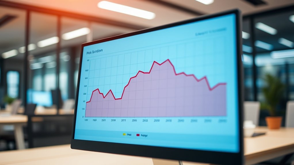
Risk burndown charts are powerful tools that help you visualize how your project’s risks evolve over time. They give you a clear picture of your risk landscape, allowing you to track whether your risk mitigation efforts are effective and if your risk exposure is decreasing as planned. When you start a project, you typically conduct a thorough risk assessment to identify potential issues that could hinder your progress. This initial assessment helps you prioritize risks based on their likelihood and impact, setting the stage for your risk management strategy.
As your project progresses, risk burndown charts serve as a real-time visual aid to monitor how well your mitigation strategies are working. Instead of only relying on static reports, you can see how risks are being addressed over time, whether through proactive measures or corrective actions. If the chart shows that risk exposure isn’t decreasing as expected, it prompts you to revisit your risk assessment and adjust your mitigation strategies accordingly. This ongoing process ensures you stay aligned with your project goals and reduce surprises that could derail your timeline or budget.
Using a risk burndown chart encourages regular risk reviews. You can set specific checkpoints to update the chart, making it a dynamic part of your project management routine. This helps you maintain a continuous focus on risk reduction, fostering a proactive rather than reactive approach. As risks are mitigated or new risks emerge, the chart visually reflects these changes, giving you immediate insight into your overall risk health. This makes it easier to communicate with stakeholders, demonstrating how risks are being managed and how your mitigation strategies are reducing potential threats.
The chart also helps you prioritize your efforts. If certain risks remain stubbornly high despite mitigation efforts, you can channel more resources into tackling those issues. Conversely, if some risks are eliminated or markedly reduced, you can reallocate resources or shift focus to emerging risks. This flexibility ensures your risk management remains responsive and effective. Additionally, understanding the value of home security systems in various contexts can inform your risk mitigation strategies by emphasizing deterrence and rapid response. Ultimately, risk burndown charts empower you to make informed decisions, helping you maintain project stability by continuously tracking your risk exposure and adjusting mitigation strategies as needed. They turn complex risk data into actionable insights, keeping your project on track and reducing the likelihood of unexpected setbacks.
Frequently Asked Questions
How Do Risk Burndown Charts Integrate With Agile Project Management?
You use risk burndown charts in agile project management to visually track risk reduction over time, helping you prioritize risks effectively. By updating the chart regularly, you can engage stakeholders in risk prioritization, ensuring everyone stays informed about potential issues. This ongoing visibility fosters proactive risk mitigation, enabling your team to adapt quickly and maintain project momentum while addressing high-priority risks early.
What Tools Are Best for Creating Risk Burndown Charts?
You should consider tools like Jira, Excel, or Power BI for creating risk burndown charts. These tools excel at risk assessment and offer extensive chart customization options, helping you visualize your risk exposure over time. Jira integrates smoothly with agile workflows, while Excel and Power BI give you flexibility to tailor charts to your specific project needs. Choose based on your team’s complexity and preferred level of customization.
How Often Should Risk Exposure Be Updated in the Chart?
You should update risk data as often as you want to make certain you’re in control. In reality, updating risk exposure weekly or after significant project milestones ensures your chart stays accurate. The key is maintaining a consistent update frequency that reflects project changes, so your risk burndown chart provides real insight rather than outdated numbers. Don’t wait too long; otherwise, you might as well ignore risk management altogether.
Can Risk Burndown Charts Predict Project Success or Failure?
Risk burndown charts can aid in project forecasting by providing visual insights into risk reduction over time, but they can’t definitively predict success or failure. Your risk analysis helps monitor potential issues, but external factors and team responses influence outcomes. Use these charts as a proactive tool to identify trends and adjust strategies, increasing your chances of project success while understanding that predictions always involve some uncertainty.
What Are Common Pitfalls in Interpreting Risk Burndown Charts?
You might fall into common pitfalls like risk misinterpretation or data inaccuracies when analyzing risk burndown charts. Be cautious not to assume that a decreasing risk line always means your project is safe, as misreading trends can lead to false confidence. Also, verify the data is accurate and up-to-date; outdated or incorrect data skews your understanding of true risk exposure, causing potential oversight of emerging issues.
Conclusion
By mastering risk burndown charts, you’ll conquer project chaos like a superhero wielding a shield of clarity. Imagine being able to foresee every lurking danger before it strikes, turning chaos into calm with a single glance. With these charts, you’ll crush risks so effortlessly, it’ll feel like you’ve tamed a wild beast with just a flick of your wrist. Get ready to transform your risk management game into an unstoppable force of precision and control!