
To create design docs that get read, you need a clear, concise template that organizes information logically and visually attracts attention. Use descriptive headings, bullet points, and visuals like diagrams or mockups to break up text and highlight key points. Keep content simple, avoid jargon, and focus on essential details. By following a proven structure and emphasizing clarity, you’ll make your documents more engaging. If you keep going, you’ll discover how to craft templates that truly resonate.
Key Takeaways
- Use clear, descriptive section headings with consistent formatting to guide readers effortlessly through the document.
- Incorporate visuals like diagrams, mockups, and flowcharts to clarify complex ideas and maintain engagement.
- Keep content concise, focusing on essential details, and avoid jargon to ensure accessibility across disciplines.
- Organize information logically, starting with an overview and progressing to technical specifics for a smooth reading flow.
- Highlight key points with formatting techniques such as bold text, color, and size variation to emphasize importance.
Why a Clear, Concise Design Document Matters for Your Team

A clear, concise design document is essential because it serves as the blueprint for your team’s work. It transforms complex ideas into effective visual storytelling, ensuring everyone understands the project’s goals. When you cut through unnecessary technical jargon, you make the document accessible to both technical and non-technical team members. This clarity helps prevent misunderstandings, reduces rework, and accelerates decision-making. By focusing on essential details and presenting them logically, you enable your team to grasp the scope quickly. Your design document becomes a shared reference point, fostering collaboration and alignment. Ultimately, a well-crafted, straightforward document keeps the project moving efficiently and keeps everyone on the same page, making it more likely your work will be read, understood, and executed successfully.
Key Components Your Design Document Must Cover

To guarantee your design document effectively guides your team, it must include several key components. Start with a clear problem statement that outlines the challenge you’re addressing, avoiding unnecessary technical jargon. Include a detailed solution overview to explain your approach succinctly. Incorporate diagrams or mockups to visualize your ideas, aiding team onboarding for new members. Define technical specifications, such as API endpoints or data models, to ensure clarity for engineers. Add success criteria and metrics to measure progress. Additionally, understanding the importance of authenticity and existence in your project scope can help align your team’s efforts with real-world needs. Recognizing the role of AI and Content Creation tools can also streamline documentation processes and enhance content accuracy. Finally, highlight dependencies and potential risks to preempt issues. These components ensure everyone understands the project scope, technical details, and objectives, making your design document a practical tool that guides development and facilitates team onboarding. A thorough understanding of attention to detail is essential for creating comprehensive and effective design docs. Additionally, emphasizing clear communication helps align team efforts and reduces misunderstandings throughout the project.
How to Structure Your Design Document for Easy Navigation

To make your design document easy to navigate, start with clear section headings that guide readers through your content. Organize your information in a logical order so readers can follow your reasoning effortlessly. Incorporating interior design basics, such as mood boards and narratives, into your structure can further enhance comprehension and showcase your expertise. Additionally, understanding essential oils for various health concerns can provide valuable insights into how different elements can be integrated for a comprehensive presentation. Including AI-powered tools in your planning process can also streamline content creation and editing, making your document more efficient to produce. Moreover, considering how to status can help you maintain the appropriate updates and progress markers throughout your documentation process. Leveraging outdoor safety strategies can also ensure your design document emphasizes practical applications and real-world relevance.
Clear Section Headings
Clear section headings are essential for guiding readers through your design document and helping them find information quickly. Well-structured headings break down complex ideas and make navigation seamless. To make your headings effective, consider these tips:
- Use descriptive, concise titles that clearly indicate the section’s content.
- Maintain consistent font choices and size for headings to enhance readability.
- Incorporate color schemes that differentiate sections without overwhelming the reader.
- Emphasizing European cloud innovation in your headings can highlight your commitment to sustainable and secure cloud solutions.
Logical Content Flow
Have you ever struggled to find information quickly in a design document? A logical content flow makes this easier. Start with an overview that sets the context, then organize sections by priority or process steps. Use clear headings and subheadings to guide readers seamlessly between topics. When discussing color schemes and font choices, group related details together, so readers can compare options effortlessly. Maintain a consistent structure for each section—introduce the topic, provide details, and summarize key points. This flow helps readers follow your reasoning without confusion. Avoid jumping around; instead, build your document like a story that naturally progresses. Well-structured content ensures your design document is easy to navigate, saving time and reducing frustration for everyone involved. Incorporating simple, room-by-room solutions from the knowledge base can also help create a more organized and calming presentation of your ideas. Additionally, including best gelato spots in your content structure can serve as engaging examples to illustrate your points about quality and organization. To enhance understanding, consider visual aids like diagrams or flowcharts that reinforce the logical content flow and make complex information more accessible. Incorporating clear categorization can further improve navigation and comprehension throughout your design documentation. Moreover, utilizing visual aids such as diagrams and flowcharts can significantly boost clarity and retention.
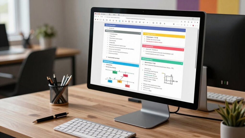
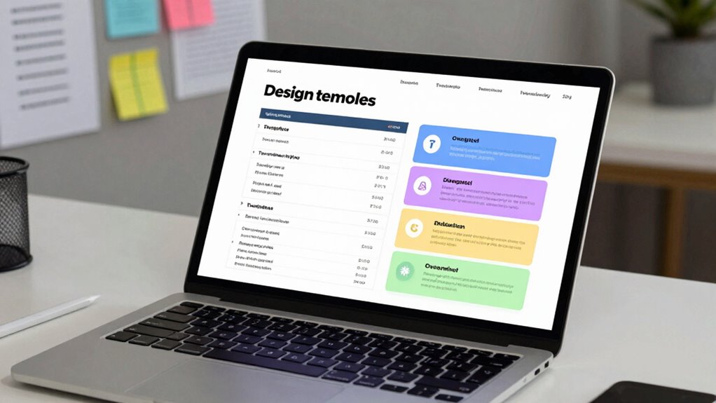
Streamline Your Writing With a Simple Design Doc Template

A simple design doc template can transform your writing process by making it more efficient and focused. It helps you maintain a clear visual hierarchy, so key ideas stand out and guide your reader smoothly. Plus, it guarantees branding consistency, keeping your document professional and aligned with your team’s style. To streamline your writing, consider these steps:
- Use headings and bullet points to organize information clearly.
- Keep sections concise, focusing on core points without filler.
- Apply consistent formatting for headings, fonts, and colors to reinforce branding.
- Incorporate visual elements like diagrams or images to enhance clarity and engagement—especially useful when presenting complex concepts like contrast ratio in projectors.
This approach saves time, reduces confusion, and makes your design docs more engaging. Using a structured layout can further improve readability and ensure your message is effectively communicated. Paying attention to visual hierarchy helps emphasize important information and guides the reader seamlessly through your document. With a straightforward template, you’ll produce documents that are easy to read, visually appealing, and aligned with your overall branding.
How to Write Headings and Sections That Keep Readers Engaged
To keep your readers engaged, focus on using clear, concise language that quickly conveys your main ideas. Incorporate engaging formatting techniques like headings, bullet points, and bold text to break up content and highlight key points. When you effectively combine these strategies, your headings and sections will invite readers to stay and explore your entire document. Additionally, emphasizing brewing methods and their impact on flavor and caffeine levels can enhance reader interest and understanding. Techniques like visual and auditory cues can also support learning and retention, making your content more accessible and memorable. To improve your writing further, consider using tools that help detect and eliminate passive voice, ensuring your messages are direct and impactful. Furthermore, aligning your content with home theater design principles can create a more immersive and engaging experience for your audience.
Clear and Concise Language
Clear and concise language is essential for writing headings and sections that keep readers engaged. When you simplify your wording, you make your ideas accessible and avoid confusion. To do this effectively:
- Use jargon avoidance—ditch complex terms unless absolutely necessary, and if you do, explain them clearly.
- Prioritize technical simplicity—break down complex concepts into straightforward, digestible parts.
- Keep sentences short and direct, focusing on one idea at a time for maximum clarity.
Engaging Formatting Techniques
Have you ever noticed how some sections make you want to keep reading while others make you tune out? Engaging formatting techniques can make your design docs stand out. Use clear headings with graphic design principles to guide the reader’s eye and establish branding consistency. Bold, size variation, and color can highlight key sections, making them easier to scan. Break content into digestible sections with ample white space, preventing overwhelm. Incorporate visual elements like icons or diagrams to reinforce points and add visual interest. Consistent formatting across headings and subheadings builds familiarity and professionalism. When your document looks inviting and well-structured, readers stay engaged longer. Well-designed formatting doesn’t just look good—it guarantees your message gets across effectively.
How to Use Visuals and Examples to Make Your Design Docs Pop
Ever wonder why some design documents immediately grab your attention while others fall flat? The key lies in effective use of visuals and examples. Visual storytelling transforms complex ideas into clear narratives, making your points more memorable. Incorporating illustrative examples helps your audience understand abstract concepts by connecting them to real-world scenarios. To make your design docs pop, consider these tips:
- Use diagrams and flowcharts to clarify processes.
- Include annotated screenshots to highlight key features.
- Add real-life examples that relate to your audience’s experiences.
These elements break up text and reinforce your message, ensuring your design docs are engaging and easy to follow. Mastering visual storytelling and illustrative examples keeps your readers interested and makes your ideas stick.
Common Mistakes to Avoid When Drafting Your Design Document

Are you risking your design document’s effectiveness by overlooking common pitfalls? One mistake is relying too heavily on technical jargon, which can alienate or confuse readers unfamiliar with certain terms. Keep your language clear and accessible, especially for stakeholders outside your technical team. Another trap is including excessive detail; while thoroughness is important, overwhelming your reader with every minor aspect dilutes your main points and hampers understanding. Focus on high-level concepts and key decisions, saving the granular specifics for appendices or supplementary sections. Avoid ambiguity by being precise, and steer clear of vague statements that leave room for misinterpretation. By steering clear of these mistakes, you’ll craft a design document that’s both impactful and easy to digest.
How to Revise Your Design Document for Clarity and Impact

To guarantee your design document communicates effectively, you need to revise it with clarity and impact in mind. Focus on enhancing visual storytelling—use diagrams, charts, and visuals to clarify complex ideas. Simplify language to ensure your message is accessible across disciplines, fostering cross-disciplinary collaboration. Here are three steps to refine your document:
- Streamline Content: Remove jargon and redundancies; make every sentence purposeful.
- Enhance Visuals: Incorporate clear visuals that complement your narrative and highlight key points.
- Seek Feedback: Share drafts with colleagues from different backgrounds to identify confusing sections and improve overall clarity.
Revising with these strategies helps your design document resonate, ensuring your ideas are understood and embraced by diverse stakeholders.
Adapting Your Design Document Template for Different Projects and Teams
Adapting your design document template to fit different projects and teams guarantees your communication remains effective across varying contexts. You need to tailor the content to match the project scope, highlighting what’s essential and omitting unnecessary details. For larger, complex projects, include thorough sections on architecture and dependencies; for smaller tasks, focus on core objectives and quick summaries. Ensure stakeholder alignment by adjusting your language and depth of detail based on the audience’s familiarity and needs. Different teams may prioritize different aspects—engineering teams might want technical specs, while product teams focus on user flows. Flexibility in your template helps you communicate clearly, maintain engagement, and foster shared understanding regardless of project size or team composition.
Final Checklist: Review Your Design Document Before Sharing

Have you double-checked your design document for clarity, accuracy, and completeness? Before sharing, review your work carefully. First, verify all branding elements are consistent, so your document maintains a professional appearance. Second, incorporate team feedback—double-check that comments and suggestions are addressed and clear. Third, scan for any gaps or ambiguities that could confuse readers or stakeholders. Confirm that technical details are accurate and that visuals support your points. A thorough review helps prevent misunderstandings and demonstrates professionalism. Remember, a well-polished design doc encourages engagement and collaboration. Taking these final steps ensures your document is compelling, clear, and ready to make an impact.
Frequently Asked Questions
How Do I Tailor My Design Doc for Different Project Sizes?
You tailor your design doc by adjusting its depth based on project scope, ensuring you include only relevant details. For smaller projects, focus on core objectives and quick wins, while larger projects need thorough stakeholder alignment, detailed timelines, and risk assessments. Keep it clear and concise for stakeholders, emphasizing what’s essential. This way, your design doc remains effective, engaging, and aligned with project size, encouraging reading and understanding across all team members.
What Tools Can Help Me Create Effective Visuals Quickly?
Your visuals can be as powerful as a lightning bolt with the right tools. Use visualization tools like Lucidchart or Miro, which let you create clear, professional diagrams fast. Diagram software such as draw.io or Microsoft Visio offers intuitive features that help turn complex ideas into simple visuals instantly. These tools streamline your process, saving you time and making your design docs more engaging and easier to understand.
How Detailed Should the Technical Explanations Be?
You should aim for a balance in technical depth that matches your audience’s expertise, ensuring your explanations are clear and accessible. Focus on clarity by avoiding jargon unless necessary, and provide enough detail to convey your ideas without overwhelming. Use examples to illustrate complex concepts, and consider including visuals to enhance explanation clarity. This approach keeps your technical explanations engaging and easy to understand, increasing the likelihood your design doc gets read.
How Can I Ensure My Team Actually Reads the Document?
You can boost your team’s engagement and guarantee your document gets read by making it easily accessible and relevant. Share it during meetings, highlight key points, and encourage feedback. Use clear headings and visuals to improve document visibility. Keep the content concise and actionable, so your team stays interested. Regularly remind your team of its importance, fostering a culture where reading the document becomes a priority rather than an afterthought.
What’s the Best Way to Handle Feedback and Revisions?
Think of handling feedback and revisions like steering a river’s twists—stay flexible and open. You should establish clear feedback loops, encouraging your team to share constructive conflict resolution. When revisions come in, address each point systematically, keeping communication open and respectful. This way, you turn potential conflicts into collaboration, ensuring everyone’s input improves the document and your project, flowing smoothly toward success.
Conclusion
Now that you’ve got the blueprint for creating effective design docs, remember that clarity is king. Keep your document focused and engaging, so your team stays on the same page. Don’t let details fall through the cracks—review and revise diligently. When you craft your design document with purpose, you’ll avoid reinventing the wheel and keep projects moving smoothly. It’s the proof that a well-structured plan can make all the difference in getting everyone on board.