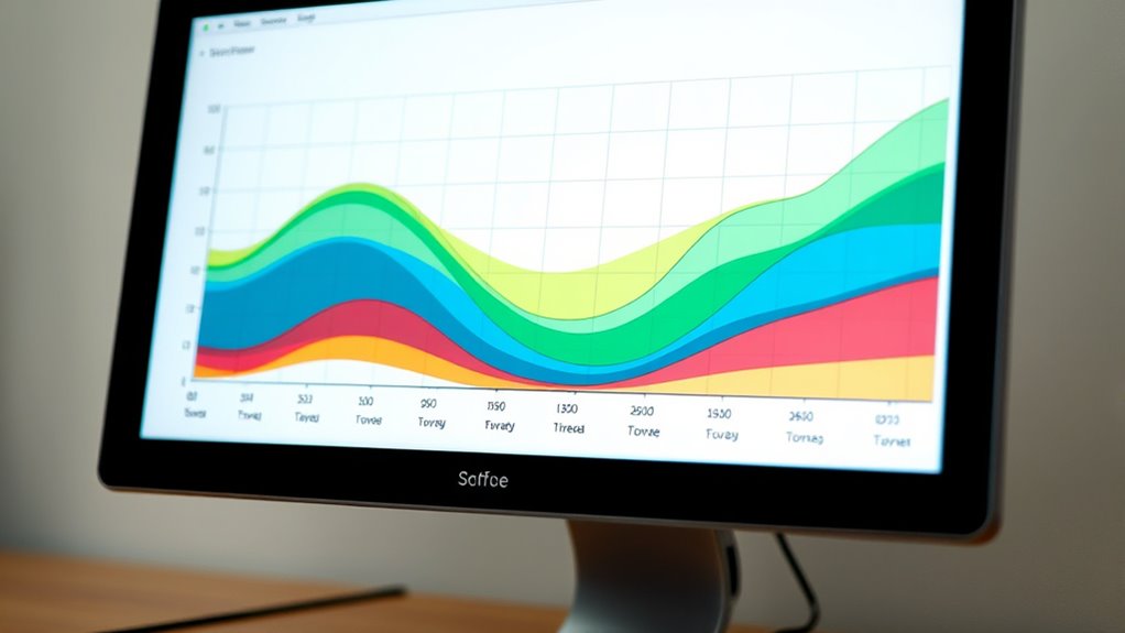
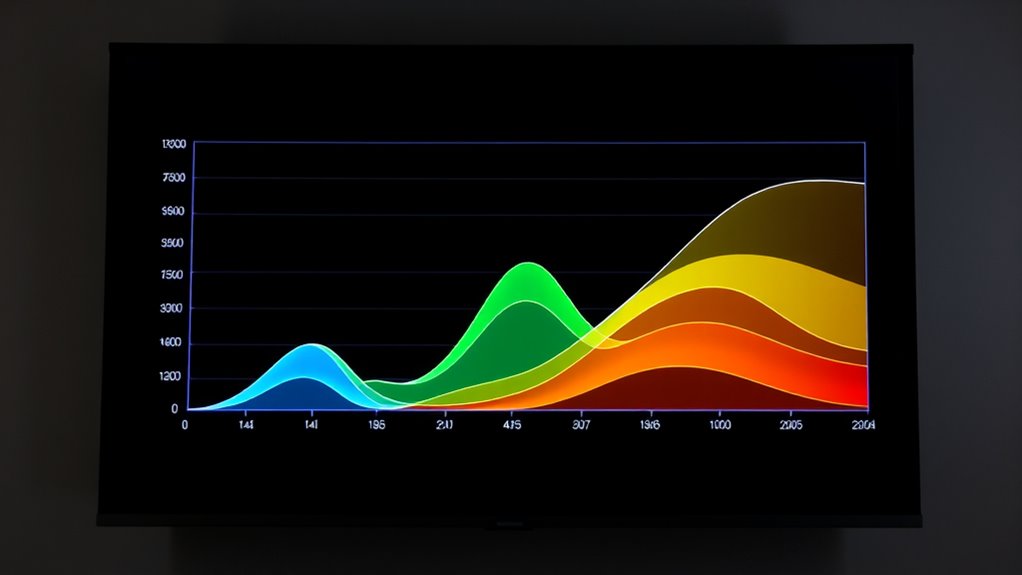
To understand a cumulative flow diagram, look at how work items move through different stages over time. The colored bands show phases like “To Do,” “In Progress,” and “Done.” Widening bands indicate work piling up, revealing bottlenecks, while narrowing bands suggest smooth flow. Steady, straight lines mean consistent progress, and irregular shapes highlight issues. Continuing will help you uncover tips to interpret patterns and improve your workflow.
Key Takeaways
- The CFD shows work stages over time, with color bands representing different phases like “To Do,” “In Progress,” and “Done.”
- Widening bands indicate work accumulation or bottlenecks, while narrowing bands suggest smooth workflow flow.
- The shape and slope of the bands reveal workflow consistency, irregularities, or inefficiencies.
- Flat or steep bands highlight potential delays or process issues needing attention.
- Analyzing patterns helps identify bottlenecks, optimize workflows, and improve team collaboration.
Have you ever wondered how teams track their progress over time? The answer often lies in visual tools like the Cumulative Flow Diagram (CFD). This diagram provides a clear, real-time snapshot of your workflow, making it easier to identify bottlenecks, monitor progress, and improve overall efficiency. When you understand how to read a CFD, you can enhance workflow optimization and foster better team collaboration, ensuring everyone stays aligned and productive.
A CFD displays the amount of work in different stages of your process over a specific period. Each color band in the diagram represents a phase—such as “To Do,” “In Progress,” or “Done.” By looking at the diagram, you can quickly see how work accumulates and flows through your pipeline. For example, if you notice a widening band in the “In Progress” stage, it signals that work is piling up there, possibly indicating a bottleneck. Conversely, a narrowing band suggests work is moving smoothly through that phase.
Understanding the shape of these bands helps you assess your team’s workflow. A steady, straight line indicates consistent progress, while irregularities hint at process issues. When the bands are flat or growing steeply, it signifies that work isn’t moving efficiently, which can hinder project delivery. Recognizing these patterns allows you to make informed decisions about process adjustments, prioritization, and resource allocation. Additionally, proper asset division can help ensure that resources are allocated effectively to prevent bottlenecks and optimize flow.
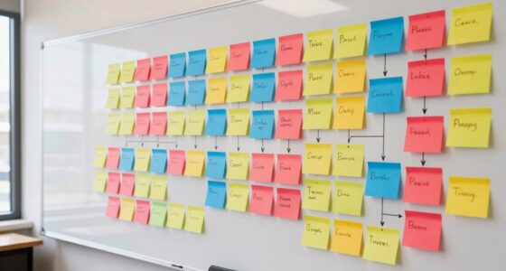
The CFD also plays a pivotal role in team collaboration. When everyone can see the same visual, it promotes transparency and shared understanding. Team members can identify where their efforts are needed most or where delays might be occurring. This shared visibility encourages proactive communication and collective problem-solving, preventing misunderstandings and ensuring that everyone is working toward common goals. It becomes a central reference point for discussions about workload, priorities, and deadlines.
Moreover, the diagram helps you track your team’s capacity and predict project completion times. If the flow remains steady, you can confidently estimate delivery dates. If the flow slows down or stalls, it signals that adjustments are needed before delays impact the deadline. Over time, analyzing CFD trends can help you optimize workflows, eliminate waste, and streamline processes. It turns raw data into actionable insights, enabling continuous improvement.
In essence, mastering how to read a Cumulative Flow Diagram empowers you to oversee your projects with clarity. It enhances workflow optimization by highlighting inefficiencies and accelerates team collaboration through shared understanding. When you leverage this tool effectively, you create a more transparent, responsive, and productive work environment where progress is visible, issues are addressed promptly, and success becomes more achievable.
Frequently Asked Questions
How Can I Customize a Cumulative Flow Diagram for My Team?
To tailor a cumulative flow diagram for your team, start by adjusting the workflow visualization to match your specific process stages. You can add or remove columns, change colors, or set custom labels to better reflect your team’s workflow. This helps improve team collaboration by making the diagram more relevant and easier to interpret. Regularly update the diagram to guarantee it stays aligned with your evolving project needs.
What Are Common Mistakes When Interpreting a CFD?
You might be sailing into stormy waters if you misinterpret data or ignore trends on a CFD. Common mistakes include focusing solely on the current work in progress without considering flow over time, which can lead to false assumptions about team capacity. Ignoring the rising or falling slopes of the bands risks missing bottlenecks or improvements. Always watch the bigger picture, not just snapshots, to steer your team smoothly forward.
How Does CFD Relate to Other Agile Metrics?
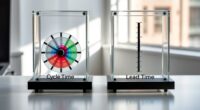
You see how a CFD relates to other agile metrics by providing clear workflow visualization, helping you identify bottlenecks and track progress over time. It complements velocity, cycle time, and lead time, offering a holistic view of your process. By analyzing the CFD, you can make data-driven decisions for process optimization, ensuring your team remains efficient and focused on delivering value consistently.
Can a CFD Predict Project Delivery Date?
Think of a CFD as a weather forecast for your project’s workflow. While it can hint at upcoming delays by showing workflow bottlenecks, it doesn’t predict exact delivery dates. By analyzing the flow and team performance, you can gauge progress and anticipate potential issues, but don’t rely solely on the CFD for precise deadlines. Use it as a guiding tool to adjust plans and keep your project on track.
What Tools Are Best for Creating CFDS?
You should use tools like Jira, Trello, or Azure DevOps for creating CFds, as they integrate Kanban boards and burndown charts. These tools allow you to visualize work-in-progress, track flow, and identify bottlenecks effectively. Kanban boards help organize tasks visually, while burndown charts complement CFds by showing progress over time. Choose a platform that best fits your team’s workflow and project complexity.
Conclusion
So, now that you know how to read a cumulative flow diagram, you can easily track your team’s progress and spot bottlenecks. Isn’t it empowering to visualize your workflow so clearly? By understanding the flow and any delays, you can make smarter decisions and keep projects moving smoothly. Remember, a well-read diagram isn’t just data — it’s your roadmap to continuous improvement and success. Ready to harness its full potential?